The Hockey Stick – A Climate Awakening

The Pivotal Graph That Stirred the World: Understanding the "Hockey Stick" Phenomenon
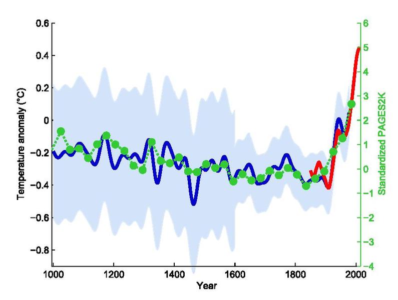
In 1998, the scientific community and the world at large were confronted with a graph that would become a pivotal symbol in understanding climate change. This graph, published by Michael Mann, depicted a stark reality of our planet's climate - a long, stable period followed by a sudden and sharp increase in temperature, much like the shape of a hockey stick. BBC's "Uncharted" podcast, hosted by Hannah Fry, delves into this phenomenon in an episode titled "The Hockey Stick," narrating the journey of the scientists behind this discovery and the subsequent turmoil it incited.
The Birth of the Hockey Stick
The hockey stick graph was born out of decades of diligent work by scientists worldwide, braving harsh conditions to gather evidence from the most remote corners of the Earth. These intrepid researchers scaled mountains and navigated oceans to collect data from ice cores, tree rings, and coral samples, piecing together a comprehensive climate history. This monumental task was undertaken to answer a pressing question: Was the observed warming of the Earth an anomaly, or was it part of a natural cycle?
 The Climate Gate Scandal
However, the hockey stick graph and its implications were not welcomed by all. In 2009, a group of hackers infiltrated the University of East Anglia's server, leaking a trove of emails to and from Michael Mann. This event, known as the Climate Gate scandal, painted Mann and his colleagues as conspirators, fabricating evidence for climate change. The leaked emails were misconstrued and used to fuel a narrative of deceit, sparking a global debate over the reality of climate change and casting a shadow over the scientists involved.
The Science Behind the Graph
Amidst the scandal, the fundamental question remained: How did scientists like Michael Mann reconstruct the Earth's climate history? The podcast sheds light on the meticulous process involving various forms of proxy data. From the Andean ice caps to the Line Islands' corals, each layer of ice and each ring of coral held keys to the Earth's climatic past. These natural archives recorded the annual rhythms of the planet, providing a detailed and accurate record of historical temperatures.
The Impact of the Hockey Stick
The publication of the hockey stick graph marked a turning point in our understanding of climate change. It consolidated the work of hundreds of researchers into a simple, yet powerful visual representation of our planet's warming. The graph not only substantiated the reality of human-induced climate change but also galvanised the scientific community and the public. Despite the controversy and personal attacks faced by Michael Mann and his colleagues, subsequent research and numerous investigations have validated the graph's findings.
Looking Forward
Today, the hockey stick graph stands as a testament to scientific perseverance and integrity. It continues to be a rallying point for those advocating for immediate action against climate change. The podcast, "The Hockey Stick" by Hannah Fry, not only recounts the tumultuous journey of the graph and its creators but also serves as a reminder of the pressing need to address the undeniable reality of climate change. As the planet continues to warm at an unprecedented rate, the story of the hockey stick graph and the scientists behind it urges us to reflect on our role in shaping the future of our planet. It's not just a tale of data and graphs but a narrative about our understanding of the Earth and our responsibility towards it.
Listen to the podcast now at the BBC website or wherever you get your podcasts, e.g. Apple, Amazon or Spotify. Podcast image courtesy of the BBC.

